
Neville Brody his design and typography for the magazine “The Face” and he is also known for his album cover designs for the Rough Trade Record company. He designed several typefaces including FF Blur, FF Gothic and Arcadia. He is a partner of FontShop International and FontWorks. He is also the founding editor of the digital magazine FUSE. Brody had created fonts where readers tended to go back and forth to pick up the interesting bits of the text they were reading. Brody was inspired by the punk rock of London’s life in 1977 and had used that as his main inspiration for his type faces. He uses large and abstract shapes to distort and fragment text, so they become their own elements in their own right. He also had a hand in designing the font Coca-Cola uses. He was also the art director at Fetish Records and its here where he began experimenting with a new type of visual language that consisted of a mixture of both visual and architectural elements.
Brody is a highly influential graphic designer and typographer. He is renowned for his work on cover and album cover designs. He also is well known for his punk aesthetic and is characterized by bold and experimental typography and the rejection of traditional design. He created the font Coca-Cola uses as well as multiple magazines like “The Face” and “Arena”. He also used photography and the layering of shapes and colours to create patterns that were visually appealing. Working with abstract I have found as an artist myself tends to get your name out there pretty quick and especially if it’s going off a political or societal change during its creation and someone like Brodey did it at the right time in my opinion. Punk art in the 70’s was at its height and with him taking ideas from it just brought everything together in my opinion. Though he is now a professor he is also now one of the most celebrated graphic designers of his generation.
I knew Brody’s work before entering this class. I had seen his work in my high school art classes. According to Brody, he always used London for the base of his work and always went back to it when he was looking for inspiration. He had explored notions of punk culture through a typographic approach and encouraged new designers to reject the idea of traditional typography and accept a newer form of experimenting and image making. He was influenced by art movements like Futurism and Dadaism which had disassembled the old ideas about painting and art. Brody was also working in a changing world which had also influenced his work. He created typefaces which could adapt on different screen sizes and resolutions. He also focussed on creating typefaces that emphasized the importance of creating a visual language which speaks to the audience and the brand name. His notable typeface included Industria, Insignia, and Blur which was used by the British Broadcasting Corporation in 2011.

Autotrace really came to me with its basic yet punk design. This font I have used before for collage products for art projects. It was made by Brody in 1994 and is published by FontFont. You can buy this font online but I just used a version from google images. This one speaks to me as I quite enjoy punk and grunge art and stuff related to it and this font really shows off what Brody had done with what he was working with.
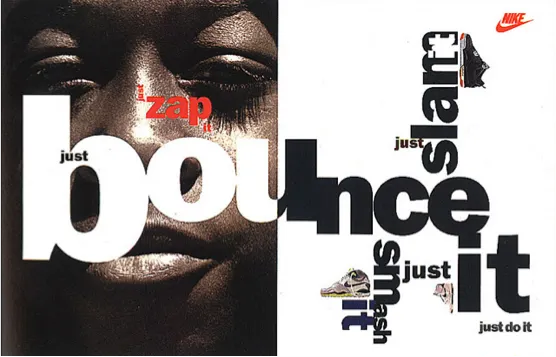
This composition is “Just Bounce It” and it worked with new forms of experimental typography and incorporated an image with varied scales of lettering and was a new typographic approach which captivated the audience to develop into active viewers. This presented a new approach to typography and Brody encouraged a whole generation of artists to try new things and be more creative with their work. He encouraged artists to be experimental and leave behind the old traditions of the old artists. He wanted artists to accept a new form of experimental type and image making.